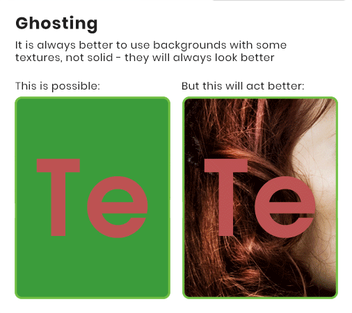
SPECIAL PRODUCTS

Design guidelines

Designing a great lenticular is not difficult, but there are many do’s and dont’s. Please use our experience in that filed and you can save a lot of time. We encourage you to contact us early in the creative phase to help you avoid common mistakes. Discussing your concept before providing final art is a really good idea. One simple change can transform a good lenticular project into a masterpiece.

Good design is money well spent. There are cases when we tell our clients: print it normally - it's a waste of your cash
— Pawel Tryzno, Lentimax CEO

flips

lenticular advertising
  • Good flip is a two-image flip.
  • Avoid high contrast in the most important areas of the image.
  • High contrast could cause ‘ghosting’ (slight transition between images). Keep any “changing” images low contrast
  • Sans fonts are better than serif. They are more readable.

animation

lenticular advertising
  • Try to use 5-10 frames for animation although 25 frames are sometimes possible.
  • Keep part of the image stable. When every part of the image is animating, the effect can be a bit disorienting.
  • The more similar the frames, the more frames could be used in project.
  • Try to use 5-10 frames for animation although 25 frames are sometimes possible.

3D

lenticular
  • Be careful with solid colour areas. There is small 3D effect on solid colour areas.
  • There should be as many interactions among objects in design as possible.
  • The closer to the focal point the object is, the sharper it will appear in lenticular design.
  • Background images should have as many details as possible.
  • Sans fonts are better than serif. They are more readable
Please read descriptions on pictures. They will give you an idea how you can manage the ghosting problem

ghosting problem - explanations